Literary scribblings, kvetching here and there, and assorted ideas related to the writing life
Friday, 17 January 2014
Non-Fiction Sidebar: Jacket Design (pt. 3)
... and then there's the homely cousin of book design, the one with lots to say and a great personality, but. That's right, the back jacket.
Paperbacks without flaps present a logistical problem: normally, a lot of information has to be crowded into a small space, and the result can look junky, cluttered, unfocussed, and etc. The plot summary, author photo, author bio, blurb(s), bar code, publisher logo, production credits, and design elements all on a 5.5 x 8.5 rectangle can make for a necessarily jammed janitor's supply closet of information.
For the back, an element or two are typically carried over from the front, the effect to make the entire jacket a thematically coherent (aka uniform) whole.
I thought it might interesting or novel to break with that tradition and have a documentary photograph: if the front cover implies the comic genre, I thought, the back would let the reader know the setting is here and now and based within two of BC's economic powerhouses: film production and post-secondary education.
I had the good fortune to visit my office on campus in early August last year during crew prep for the scenes of Tomorrowland being shot there. (Tomorrowland? It stars George Clooney, and according to IMDb, will be released in May 2015. The plot? IMDb again, being sketchy: "Bound by a shared destiny, a teen bursting with scientific curiosity and a former boy-genius inventor embark on a mission to unearth the secrets of a place somewhere in time and space that exists in their collective memory.")
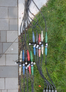
Anyhow, before being told by a rent-a-cop PA that I wasn't allowed to take photos (because, apparently, an outdoor set at a public institution is equivalent to a top secret governmental facility), I looked around for suitable book jacket images. And before the bouncer/PA escorted me away from the set (the set alone and standing outside its taped-off boundaries; there were no actors because the set was still being built), I snapped a few documentary details that I figured might look eye-catching on a back jacket—
I sent the best ones to HonkHonk. In contrast to the front cover process, there was far less discussion and virtually no back and forth regarding many possible design options.
Moving some technical concerns (eg, the author photo, the author's publications, etc) inside, along with additional information relating to design and photo credits, opened up lots of 'free' space on the back so that a relatively busy photograph could be utilized without the back cover becoming a distracting or unfocused junk pile that might annoy or confuse the the viewer's eye.
Here's the handsome final product—
Subscribe to:
Post Comments (Atom)


No comments:
Post a Comment